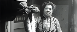
In 1902, a book by Emily Noyes Vanderpoel appeared with the most modest title imaginable: Color Problems: A Practical Manual for the Lay Student of Color. It sounds like something you’d keep beside a box of paints. Open it, and it gets strange. Everyday objects begin to dissolve into colour: Chinese porcelain becomes a grid of deep blue, ochre and violet; a Celtic ornament turns into blocks of green, red and black; even a dinner table is reduced to a pattern of yellow, blue and brown. She was looking at ordinary things and finding a completely different way to see them.
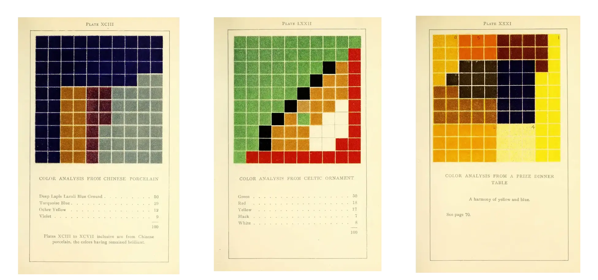
And yes, some of these studies do look startlingly modern. But, they aren’t; Vanderpoel made them in 1902.
Before the famous grids
Mondrian didn’t move decisively toward abstraction until the 1910s, and his signature grids came later in that decade. Josef Albers began Homage to the Square in 1950 and published Interaction of Color in 1963.
But, Vanderpoel was exploring colour through grids, proportion, and visual relationships more than half a century before Albers and almost two decades before Mondrian.
There is no evidence that Mondrian or Albers knew Vanderpoel’s work, so this is not a story of direct influence. But, the timelines simply make the comparison hard to ignore.
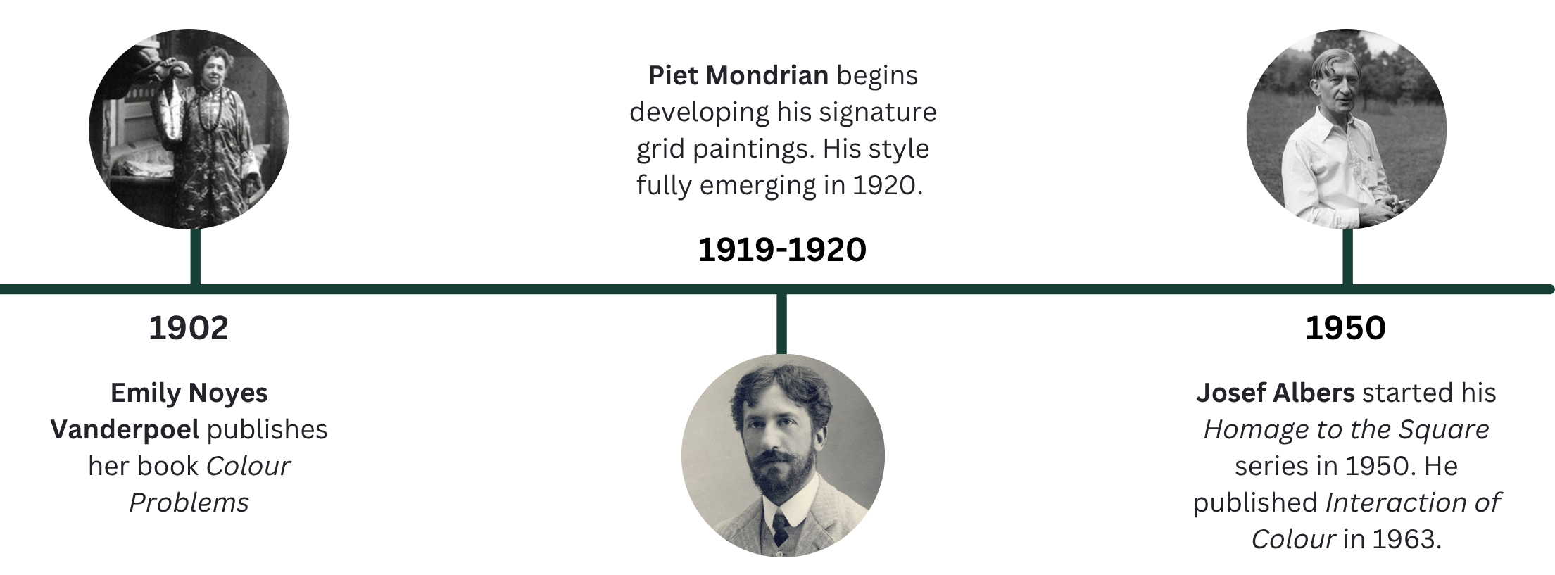
And it begs the question that if grids and visual reduction became central to the story of modern art, why is her name rarely in it?
Not an accident
Vanderpoel was no casual experimenter. Born in New York in 1842, she was a trained artist who painted in watercolour and oils, wrote about art, and served as vice-president of the New York Watercolor Club.
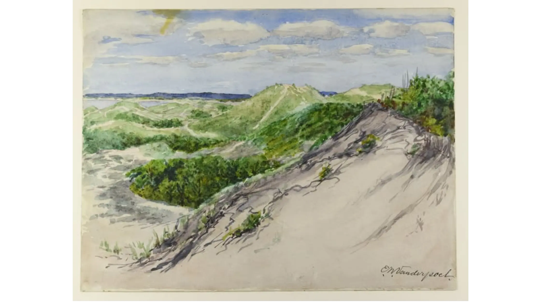
**Horseneck Beach, circa 1895. Watercolor on paper by Emily Noyes Vanderpoel**
And she thought colour belonged everywhere: in paintings, yes, but also in clothes, interiors, flowers, ceramics and textiles. She wrote for artists, designers, decorators, dressmakers and anyone who wanted to understand what they were seeing.
Her method was beautifully simple. She took a rug, a vase or a textile and reduced its colours to a grid of one hundred squares. The object vanished. What remained was a map of its colour proportions.
If that sounds like a pixelated image, it should.
There is something strangely contemporary about the way Vanderpoel broke an object down into colour and proportion. She was not working with pixels or digital tools, of course, but the logic feels familiar: look closely, reduce the image to its essential colour relationships, and rebuild it as a grid.
That is what makes the work so arresting now. The method belongs to 1902, but the way of seeing feels much closer to our own time.
So why don’t we know her?
So why did work this inventive become so easy to forget?
One reason is painfully ordinary: women’s creative work was often placed in categories that were not taken seriously.
Women were encouraged to draw, paint, embroider and decorate, and to develop an eye for colour. But those skills were treated as accomplishments, not serious artistic or intellectual work. A man working with colour and composition could be called an artist or a theorist. A woman doing the same work was more easily filed under taste, decoration, craft, or hobby.
Those labels mattered. If something was treated as fine art or theory, it was more likely to be collected, taught and written about. If it was dismissed as decoration, craft or a respectable hobby, it was much easier for it to disappear from view.
Even Vanderpoel’s subtitle hints at the problem. A Practical Manual for the Lay Student made radical visual experiments look like household instruction.
Imagine the same grids hanging on a gallery wall, wrapped in the language of modernism and we might see them very differently.
Her own story
Vanderpoel doesn’t need to become “the woman who did Mondrian first.” That would measure her by famous men who came later, and she deserves better.
What she did stands on its own. In 1902, she found a way to take the visible world apart and rebuild it through colour and proportion. She looked at a rug and saw its structure, pattern and data.
More than a century on, her plates still look strange, beautiful and oddly contemporary.
The remarkable thing is not simply that Vanderpoel was thinking about colour this way so early. It is that the work still feels fresh when you look at it now.
And perhaps the strangest part of all is that most of us were never told her name.